The Brief
To give the existing Robert Dyas Own Brand packaging a modern and premium makeover whilst still adhering to the brand guidelines.
Execution
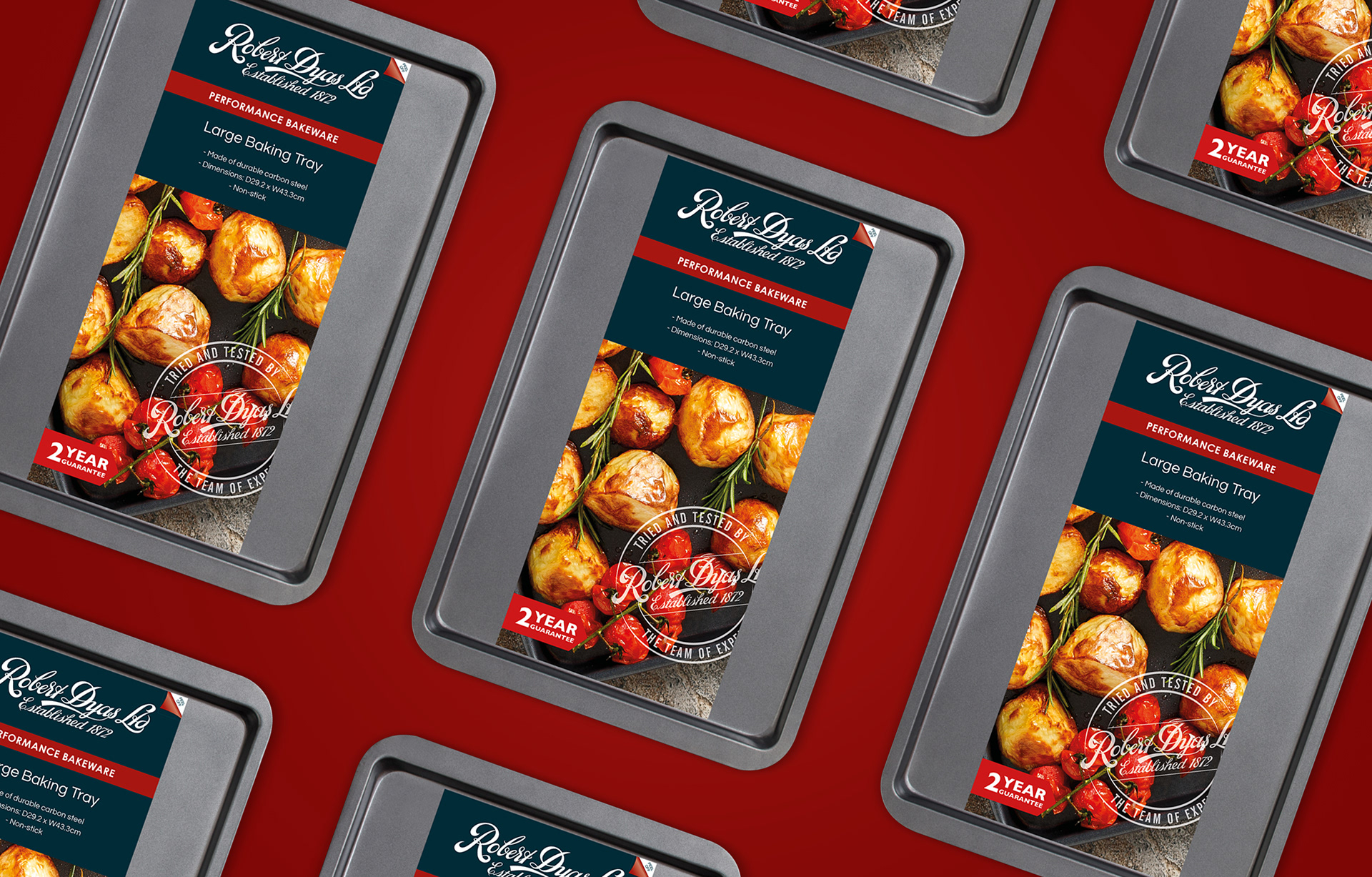
Firstly, I focused on creating a simple and functional layout that could be easily adapted to the broad scope of products in the Robert Dyas Own Brand kitchen range.
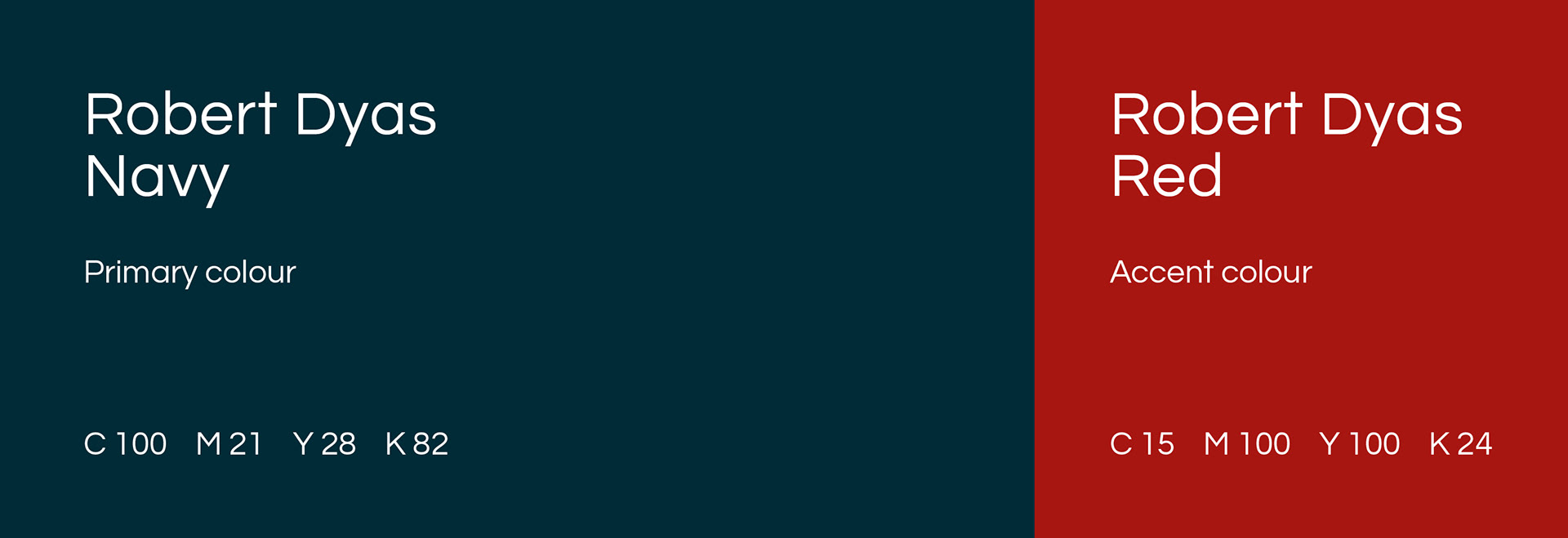
To keep in line with the brand guidelines I utilised the existing navy colour and made this the primary colour for the packaging.
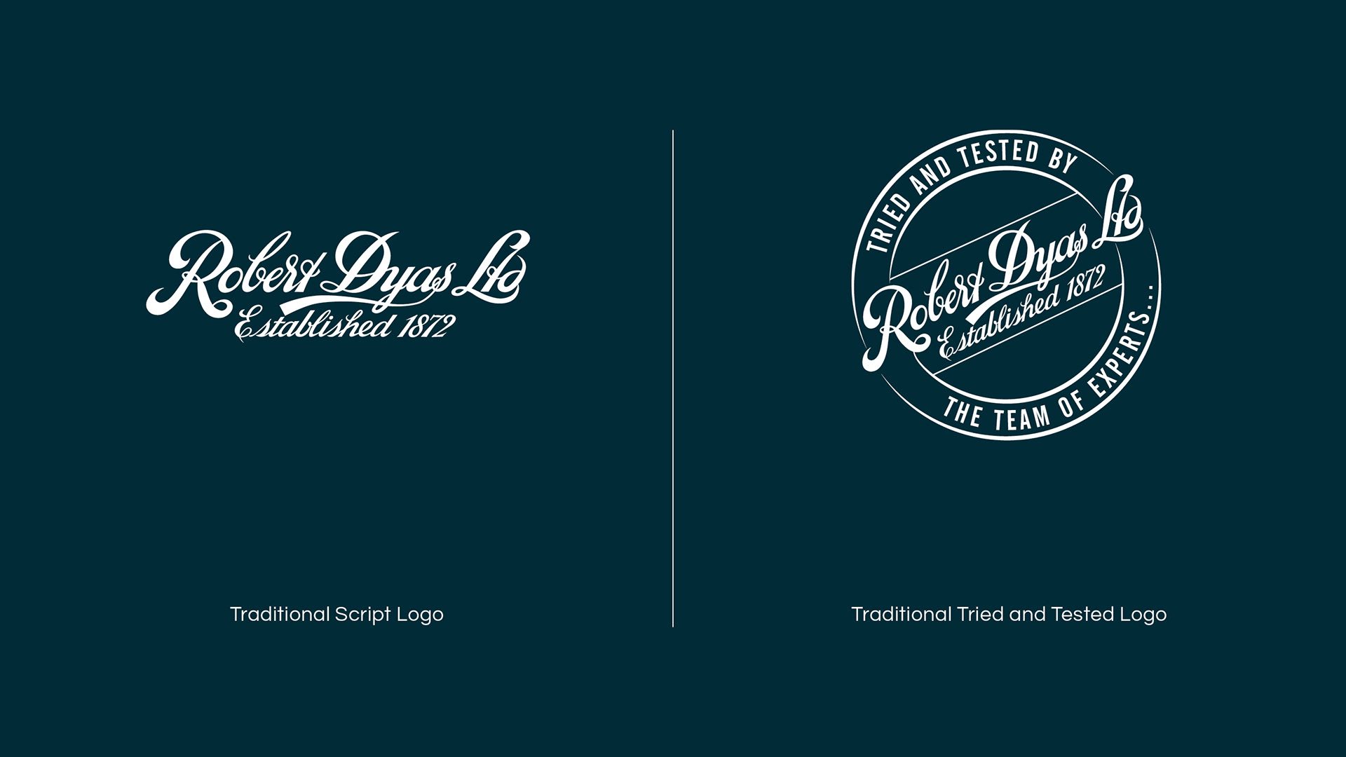
A requirement for the new packaging was to remind the customer of the companies history as one of Britains longstanding high street retailers, therefore I replaced the present logo with the original script font logo that first appeared on the first Robert Dyas store. Accompanying this is also the "Tried and Tested" logo lockup to further cement this message.
I also helped create in depth packaging guidelines that outlined everything from colour break downs and fonts, to spacing and icon positioning which would be passed onto the packaging company.
Below is a simple breakdown of some of the packaging elements as well as examples of the final packaging.
My Role
Designer
Artworker